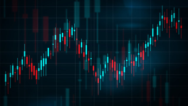
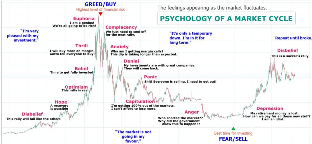
Candlestick chart is like the Swiss Army knife of trading tools in the crypto world. Whether you’re a seasoned investor or just starting out, being able to read these charts is a must. This article breaks down what candlestick charts are, how to interpret them, and how to spot basic patterns that can give you insights into price movements.
What’s a Japanese Candlestick Chart?
Imagine a chart that tells a story about an asset’s journey over time, from its highest and lowest points to where it opened and closed. That’s exactly what a Japanese candlestick chart does. Originally used by Japanese rice traders centuries ago, these charts have since become a staple in global financial markets, including crypto. They’re like the OG of technical analysis, offering valuable insights into market sentiment.
Decoding Candlestick Basics
At first glance, candlestick charts might seem like a tangled web of information, but fear not! Once you understand the basics, they’re surprisingly straightforward:
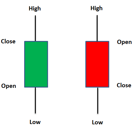
Candlestick Color: Green candles signal positive price movement, while red ones mean the opposite.
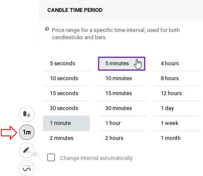
Time Intervals: Each candlestick represents a specific period of time, ranging from minutes to months. It’s up to you to choose the time interval you want to see in, shorter duration candles are better for short term trading, while longer duration candles are better for investing.
Open and Close: The body of a candlestick tells you where the asset opened and closed during that time. However, Green and Red candles are opposite in this regard. Bottom part of green Candle is opening price, while top part is where it closed. It’s opposite for Red. Top part of red candle is where it opened, and bottom part is where it closed.
High and Low: The wicks, or shadows, show the highest and lowest prices reached during the period. Meaning, those prices were reached but not sustained, while the main colored part of the body is the price range which was actually finalized.
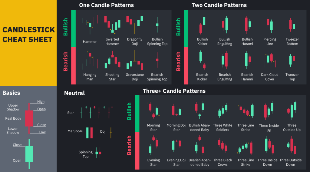
Cracking the Candlestick Patterns
Now, let’s talk patterns. Traders use these formations to predict market trends. Here are a couple of bullish and bearish patterns to get you started:
Bullish Patterns:
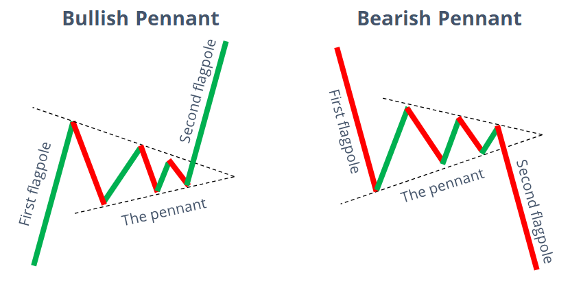
Bull Pennant: At first it looks like price consolidation, where price goes up and down in what seems a similar range. However There’s Lower High but Higher lows. This continuation pattern suggests a pause in an uptrend, followed by a likely upward surge. Opposite of it is called Bearish Pennant
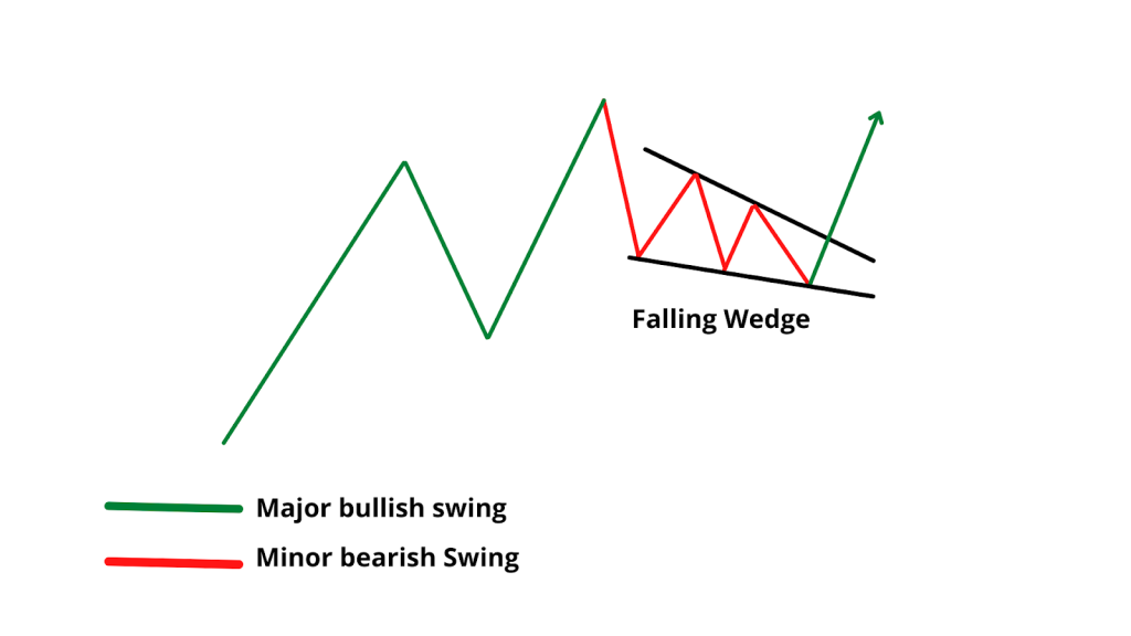
Falling Wedge: A reversal pattern indicating a potential shift from a downtrend to an uptrend. Falling Wedge looks like Pennant but on 2nd look, you will see that here we have lower highs and lower lows, traditionally bearish sign, but in this case it’s bullish.
Bearish Patterns:
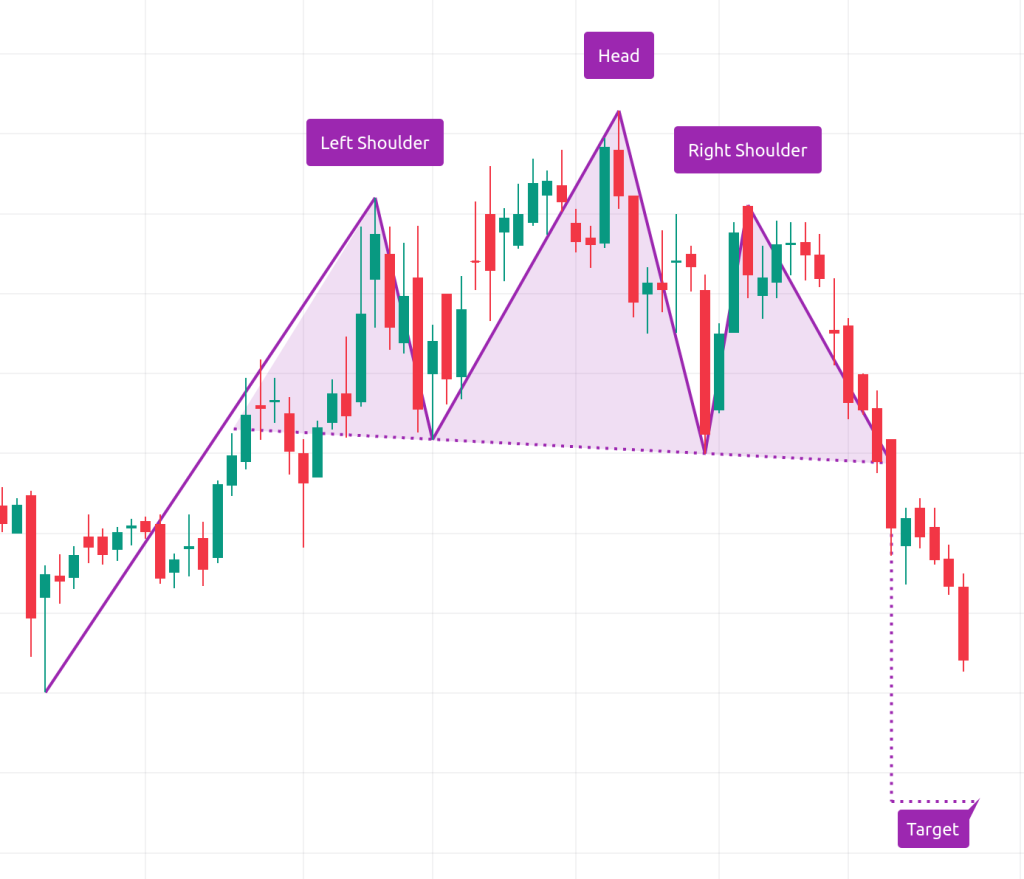
Head and Shoulders: A classic reversal pattern marked by three peaks, signaling a potential downtrend. Reversal because, if you look at the chart, prices were going up but now it’s about to get reversed, hence the bearish.
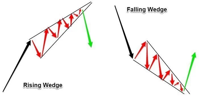
Rising Wedge: Another reversal pattern that hints at a transition from an uptrend to a downtrend. In the picture below you can see both, rising and falling one, that we already discussed. Again, it’s called reversal because the price is seemingly going up, but reverse happens.
Drawing Your Own Charts
TradingView offers handy tools like trend lines and horizontal rays to help you map out patterns and support levels. Just remember to stay objective and avoid letting emotions cloud your analysis.
Mastering candlestick charts takes time and practice, but it’s a skill worth honing for any trader. So, dive in, experiment, and remember to always base your analysis on evidence rather than emotion. Happy charting!

One Comment
Comments are closed.