The Bitcoin Rainbow Chart is a colorful and popular visual tool used by the cryptocurrency community to track Bitcoin’s historical price performance. Emerging as a humorous and hopeful concept during the 2014 bear market, it has since evolved into a widely-recognized chart, though it comes with a disclaimer that it should not be considered investment advice. I’m specifically writing this article to show that it indeed isn’t a serious investment advice.
Origins and Development
The Bitcoin Rainbow Chart was created in 2014, during a particularly volatile period for Bitcoin, right after the Mt. Gox hack, which caused significant market upheaval. In these tumultuous times, Bitcoin enthusiasts on forums like Bitcoin Talk and the r/Bitcoin subreddit sought ways to maintain morale and perspective.
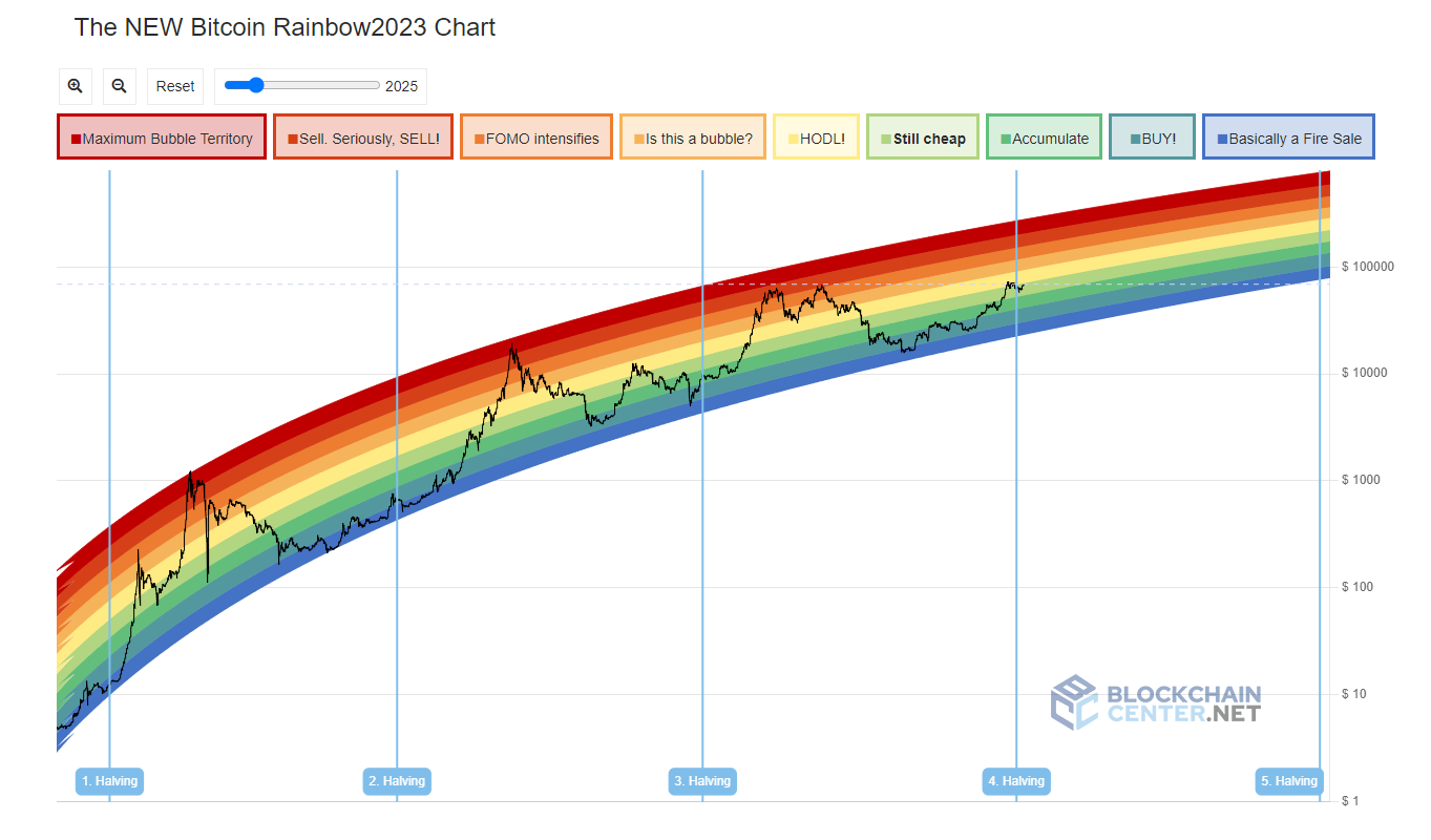
In this context, Reddit user “azop” posted the first version of the Bitcoin Rainbow Chart. It displayed Bitcoin’s price on a logarithmic scale with rainbow-colored bands, which provided a simplified visual representation of Bitcoin’s market cycles. Despite its origins as a meme, the chart quickly gained popularity and has been refined over time into the version we see today.
How to Read the Bitcoin Rainbow Chart
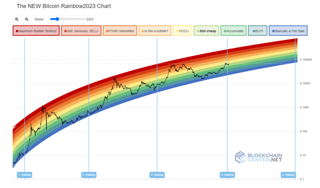
The Bitcoin Rainbow Chart features nine colors, each corresponding to different market sentiment zones:
- Red: “Maximum Bubble Territory”
- Dark Orange: “Sell”
- Orange: “FOMO (Fear of Missing Out) Intensifies”
- Light Orange: “Is this a Bubble?”
- Yellow: “HODL!” (Humorous acronym for HOLD)
- Light Green: “Still Cheap!”
- Green: “Accumulate”
- Turquoise: “BUY!”
- Blue: “A Fire Sale”
These color bands help users interpret the Bitcoin price movements:
- Red and Dark Orange indicate overbought conditions and potential market bubbles.
- Orange and Light Orange suggest increasing market speculation and potential bubbles.
- Yellow suggests holding onto Bitcoin.
- Green and Light Green suggest potential buying opportunities.
- Turquoise and Blue indicate strong buying opportunities, often during market downturns.
Accuracy and Limitations
The Blockchain Center, which hosts the Bitcoin Rainbow Chart, emphasizes that it is not intended to be used as serious investment advice. The chart is more of a morale-boosting tool and a fun way to visualize Bitcoin’s market cycles rather than a scientifically rigorous predictive model. It lacks the mathematical or scientific basis that many other technical analysis tools rely on.
The chart’s main value lies in its ability to show historical trends and provide a general sense of market sentiment over time. However, it does not predict future prices or indicate the best times to buy or sell Bitcoin with precision. Users should understand that past performance is not indicative of future results.
Conclusion
The Bitcoin Rainbow Chart is a unique and popular tool within the cryptocurrency community. Born out of a need for hope during a bearish market, it provides a colorful, easy-to-understand visualization of Bitcoin’s price history and market sentiment. It is not an investment guide, rather a fun way to look at history of Bitcoin.